 Midnight · dark leaf outlined
Brand Guidelines · 2026
Lightness,
made visual.
Levitas transforms the weight of everyday business administration into a lighter, clearer and more fluid experience. This identity translates that promise into a calm, intelligent and contemporary visual system.
01 · Concept
From daily files
to effortless flow.
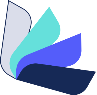
The Levitas symbol is inspired by sheets, documents, folders and files — the everyday materials businesses constantly manage. Through Levitas, these processes become simpler, more organized and lighter.
Files · folders · pagesLightness in motion
Meaning behind the name
The name Levitas is linked to lightness — the opposite of gravity. The layered forms appear to float gently, expressing relief from the weight of repetitive administrative work.
LeVitas
The symbol also subtly suggests the letters L and V, creating a direct connection to the brand name.
02 · Colors
A calm, confident
digital palette.
Indigo brings innovation and efficiency, aqua introduces freshness and lightness, while deep navy adds trust, clarity and professional stability.
Levitas Navy
HEX #11182A · RGB 17 24 42
Levitas Indigo
HEX #545DFA · RGB 84 93 250
Levitas Aqua
HEX #65E0DB · RGB 101 224 219
Mist
#DADDEA
Cloud
#F5F7FB
White
#FFFFFF
Slate
#667085
Levitas Flow
#545DFA → #65E0DB
03 · Typography
Soft character.
Clear function.
Rabelo gives the brand an elegant, distinctive and lightweight personality. Inter supports it across interfaces and body copy with excellent clarity and usability.
Levitas
ABCDEFGHIJKLMNOPQRSTUVWXYZ
abcdefghijklmnopqrstuvwxyz
0123456789 — Lightness in every task.
abcdefghijklmnopqrstuvwxyz
0123456789 — Lightness in every task.
Aa
Designed for dashboards, forms, invoices and data-rich interfaces. Clean spacing, neutral shapes and strong legibility keep the product simple and efficient.
04 · Moodboard
Floating structure,
quiet intelligence.
The visual world combines layered paper forms, soft motion, airy gradients, clean software interfaces and generous space.
Layered files · motion · clarity
Business,
made lighter.
made lighter.
Calm interface
Files in motion
Gentle anti-gravity
05 / Adaptive logo
Contrast without a white box.
When a leaf meets a background of the same color, that leaf changes from a solid fill to a fine outline. The logo keeps its full composition and remains clear without being placed on a separate white container.
Midnight · dark leaf outlined Indigo · indigo leaf outlined
 Aqua · aqua leaf outlinedCloud / light · mist leaf outlined
05 · Applications
Consistent across
every touchpoint.
The identity is designed to feel equally natural in the CRM interface, login experience, favicon, documents and business communication.
Clients · invoices · clarity